
BFA, Graphic Design
TV Channel Branding
Role: Lead graphic designer
Timeline: 9 months
Scope: Design research, motion branding, identity systems for Ramadan content
Reimagining cultural storytelling through motion and identity
This Ramadan broadcast package is a motion branding system created for an Arabic television network, designed to break from the region’s formulaic visual tropes. The system anchors the brand in a warm, contemporary narrative centered around shared rituals like the dinner table, visually expressing the emotional cadence of the holiday.
I led the full design process, from cultural research and creative direction to animation systems and style guide creation, developing a motion-first identity. The work blends broadcast storytelling with scalable design ops, delivering a package that feels both distinctly human and production-ready.
The Challenge
Research & Insights
Despite Ramadan being one of the most widely celebrated events in the Arab world, seasonal broadcast packages often rely on visual clichés, such as crescent moons, lanterns, and stock patterns that flatten cultural depth and emotional nuance.
To ground the broadcast package in cultural relevance and design intention, I conducted multi-layered research across brand, culture, and motion:
Key Insights
Arabic branding lacks typographic expressiveness due to tech constraints.
Ramadan’s core meaning circles around human connection and ritual.

Competitive analysics: Evaluated Arabic vs. Western branding systems for the same channel.

Cultural mapping: Evaluated Arabic vs. Western holiday branding binaries, identifying a “visual echo chamber” where Ramadan packages often feel visually uniform

Cultural mapping: A logo evolution audit uncovered how some brand assets remain consistent and others change.
Design Opportunity
This presented a unique opportunity:
To create a Ramadan broadcast package that goes beyond surface-level motifs and instead captures the feeling of the holiday, its rituals, its rhythm, and most importantly, its sense of togetherness.
By shifting the visual language from decorative to expressive, and using Arabic typography and motion design as emotional tools rather than ornamental ones, the system could offer a richer, more contemporary identity that still honors tradition.
Design Strategy & Ideation
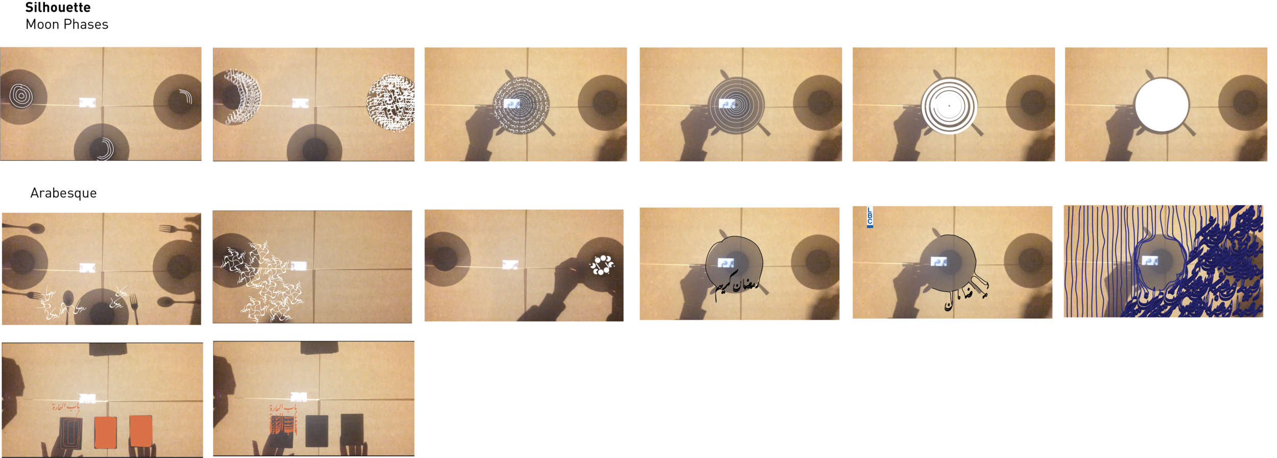
Center the iftar (dinner) table as a visual metaphor for community and warmth. This anchors every animation and identifies a unique narrative angle.
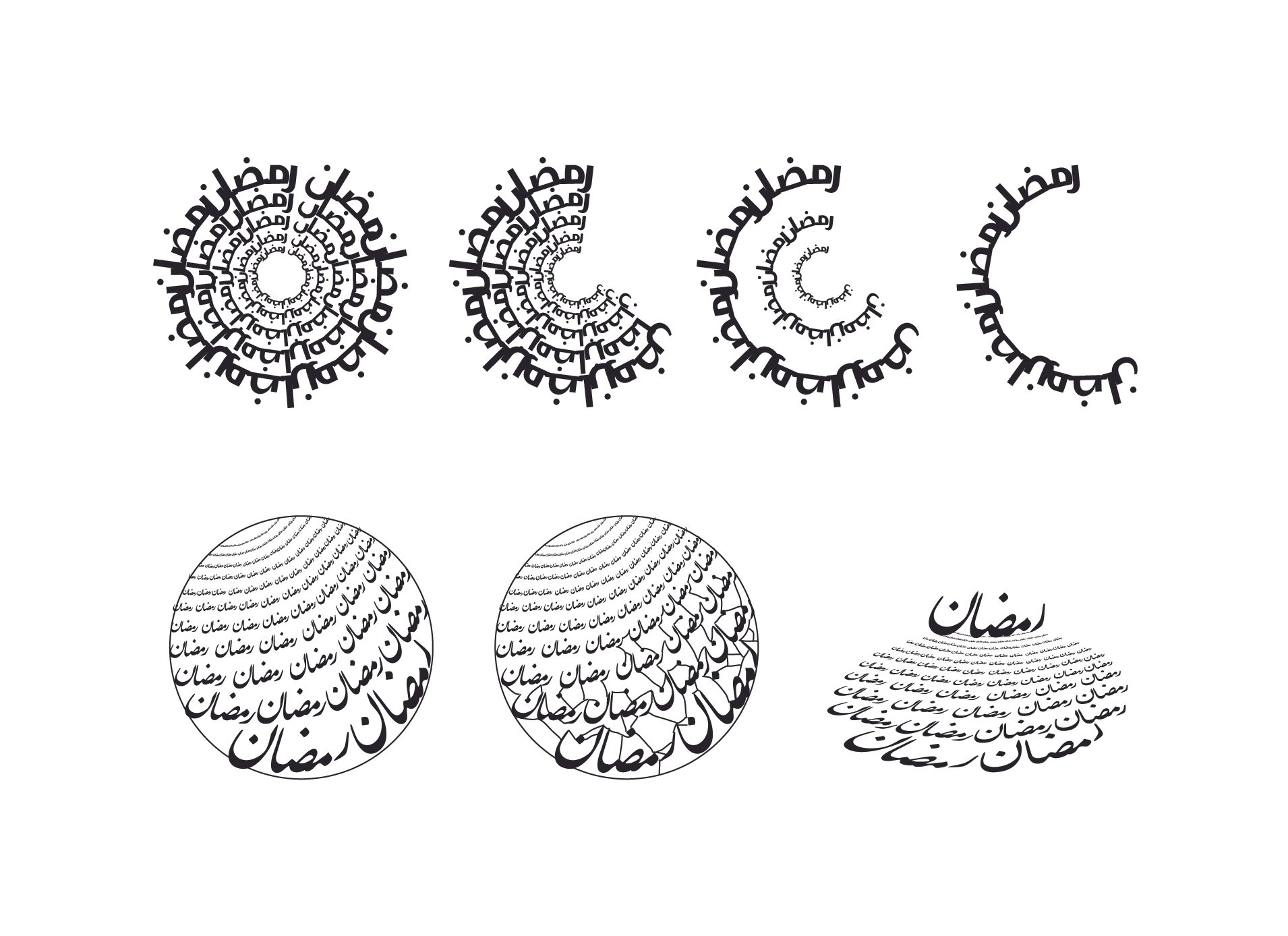
Kinetic typography exploration:
Leveraged Arabic script movement to evoke flow, ritual, and emotional resonance.
Mood & materials:
Soft golds, rich jewel tones, smooth motion easing—emphasizing calm, spiritual atmosphere.


Final Design System
The final system reimagined Ramadan branding through expressive typography-first storytelling, moving away from icon-based clichés and instead using motion, form, and music to evoke emotion.
I focused on the communal aspect of Ramadan, the moment where family and friends gather around the table to break their fast. This idea of togetherness became the core visual metaphor. The design centers on the table as both literal and symbolic space, representing warmth, routine, and human connection.
From this concept, the system pairs kinetic Arabic typography and a carefully-picked soundtrack. Type is treated as more than legible content. It becomes a vessel for cultural meaning, moving fluidly to mirror the rhythm of shared rituals. The motion evokes softness and flow, while the music emphasizes peace, stillness, and harmony.
Rather than relying on decorative symbols like crescents or lanterns, the system uses typographic form, motion, and pacing to convey emotion. It’s a scalable, emotionally resonant identity that honors tradition while offering a fresh, contemporary expression of Ramadan.
Commercial Break-In Ident
Commercial Break-Out Ident
TV Schedule Ident
LBC Channel Ramadan Promotion (A)
LBC Channel Ramadan Promotion (B)